The Model Structure Viewer example demonstrates how to integrate a hierarchical 3D model panel with a 3D viewport into a web application. This example is based on the Base Model Viewer functionality and adds a dedicated panel for visualizing and interacting with the model's structure.
User Interface Components
The Model Structure Viewer's user interface is built using React and Ant Design components. The UI architecture consists of several key components that work together to create an interactive model exploration interface:
- Main Layout Component: Orchestrates the overall interface with split-pane layout and async operations
- Structure Panel: Displays hierarchical model data with interactive tree navigation and upload functionality
- Tree Wrapper: Bridges internal tree data structures with Ant Design's visual tree component
- Tree Adapter Hook: Manages state synchronization and event handling between data and UI layers
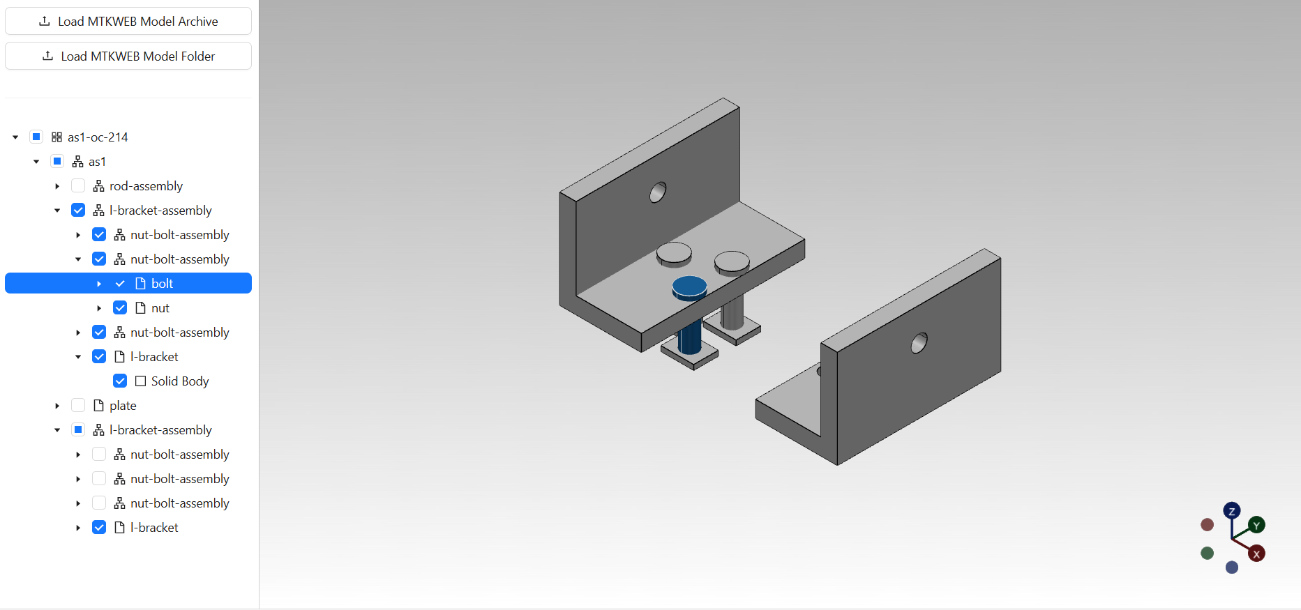
The interface is split into two main sections using a responsive layout:
- A side panel that displays the hierarchical structure of the 3D model with checkboxes for visibility control
- A main viewport that renders the 3D scene with interactive selection capabilities
ModelStructureViewer.tsx
Location: react/src/pages/model-structure-viewer/ModelStructureViewer.tsx
This is the main React component that orchestrates the entire model structure viewer interface. It creates an instance of the core viewer logic, manages model upload, and implements a responsive split-pane layout using the Allotment component. The component also defines a filter function to skip Instance nodes in the tree display, showing only their children for a cleaner hierarchy view.
export const ModelStructureViewer = () => {
const viewerRef = useRef<ModelStructureViewerRef>(new ModelStructureViewerRef());
const onUpload = useAsyncLock(async (files: File[]) => {
await viewerRef.current.loadAndDisplayModel(files);
});
const skipInstancesFilter = (node: TreeNode<unknown>): TreeNodeConversionMode => {
// ...
};
return (
<Allotment defaultSizes={[1, 4]} minSize={250}>
<ModelStructurePanel
onModelUpload={onUpload}
modelStructure={viewerRef.current.modelStructure}
treeNodeConversionFilter={skipInstancesFilter}
/>
<Viewport viewportRef={viewerRef.current.viewport} />
</Allotment>
);
};
ModelStructurePanel.tsx
Location: react/src/features/model-structure-panel/ModelStructurePanel.tsx
This component renders the side panel that displays the 3D model's hierarchical structure. The panel combines a model upload interface with an interactive tree view, allowing users to both load new models and navigate through the model structure with visual feedback.
export const ModelStructurePanel = (props: ModelStructurePanelProps) => {
const getModelStructureNodeIcon = (node: TreeNode<unknown>) => {
// ...
};
return (
<Flex className="side-panel-container" vertical gap="small">
<ModelUploadButtonGroup onUpload={props.onModelUpload} />
<Divider />
<Tree
treeRef={props.modelStructure}
checkable={true}
nodeIcon={getModelStructureNodeIcon}
conversionFilter={props.treeNodeConversionFilter}
/>
</Flex>
);
};
Tree.tsx
Location: react/src/common/ui/tree/Tree.tsx
This component serves as a React wrapper around the Ant Design DirectoryTree component, providing a bridge between the internal tree data structure and the UI representation. It supports customizable node icons, checkable nodes, and flexible tree node conversion through filter functions. The component handles tree interactions including expansion, selection, and checking operations while maintaining proper styling and accessibility features.
export const Tree = (props: TreeProps) => {
const tree = useTreeAdapter(props.treeRef, props.nodeTitleRenderer, props.conversionFilter);
const getModelStructureNodeIcon = (nodeProps: TreeNodeAttribute) => {
const nodePropsWithData = nodeProps as TreeNodeAttribute & { data: TreeDataNode };
return props.nodeIcon ? props.nodeIcon(nodePropsWithData.data.treeNode) : null;
};
return (
<div
className="tree"
style={{ '--tree-node-text-wrap': props.nodeTitleWrap } as TreeCSSProperties}
ref={tree.containerRef}
>
<DirectoryTree
blockNode={true}
checkable={props.checkable}
checkStrictly
checkedKeys={tree.checkedKeys}
onCheck={tree.onCheck}
expandAction="doubleClick"
expandedKeys={tree.expandedKeys}
onExpand={tree.onExpand}
showIcon
icon={getModelStructureNodeIcon}
multiple
selectable
selectedKeys={tree.selectedKeys}
onSelect={tree.onSelect}
treeData={tree.treeData}
/>
</div>
);
};
useTreeAdapter.ts
Location: react/src/common/hooks/useTreeAdapter.ts
This custom React hook provides the core adaptation logic between the internal Tree data structure and Ant Design's tree component requirements. It manages the conversion of tree nodes to Ant Design's data format, handles state synchronization for checked, expanded, and selected nodes, and provides event handlers for user interactions. The adapter supports filtering mechanisms to control which nodes are displayed and includes automatic scrolling functionality for better user experience during selection operations.
export const useTreeAdapter = (
tree: Tree, nodeTitleRenderer?: TreeNodeTitleRenderer, filter?: TreeNodeConversionFilter,
): TreeAdapterResult => {
const [treeData, setTreeData] = useState<TreeDataNode[]>([]);
const [checkedKeys, setCheckedKeys] = useState<TreeCheckedKeysType>({ checked: [], halfChecked: [] });
const [expandedKeys, setExpandedKeys] = useState<Key[]>([]);
const [selectedKeys, setSelectedKeys] = useState<Key[]>([]);
const convertTreeNode = (treeNode: TreeNode<unknown>, data: TreeDataNode[] = []): TreeDataNode[] => {
// ...
};
// ...
};
Note: Some components used in this example, such as useAsyncLock, ModelUploadButtonGroup, and Viewport, are shared with the Base Model Viewer and have been documented in the Base Model Viewer documentation.
Core Logic Components
The Model Structure Viewer core logic layer provides a comprehensive foundation for 3D model interaction and visualization. This layer extends the basic model viewer functionality with sophisticated tree data structures, selection management, and viewport interaction capabilities. The architecture is designed around several key component categories:
- Viewer Management: Central orchestration of model loading, tree expansion, and visibility synchronization
- Tree Data Structures: Hierarchical data management with state tracking for expansion, selection, and check states
- Interaction Components: Selection handling from viewport interactions to model element selection
These components work together to provide a seamless connection between the hierarchical tree view and the 3D viewport, enabling users to explore complex model structures through both visual and structural interfaces.
ModelStructureViewer.ts
Location: shared/src/viewers/model-structure-viewer/ModelStructureViewer.ts
This class extends the BaseModelViewer and adds comprehensive model structure management capabilities. It integrates a ModelSelectionManager for handling user interactions and automatically manages the visibility of 3D objects based on tree node check states. The viewer listens to check state changes and synchronizes them with the 3D scene visibility, providing a seamless connection between the hierarchical tree view and the 3D viewport.
export class ModelStructureViewer extends BaseModelViewer {
protected selectionManager = new ModelSelectionManager(this.viewport, this.modelStructure);
constructor() {
super();
this.modelStructure.addEventListener('nodeCheckStateChanged', this.onNodeCheckStateChanged);
}
private onNodeCheckStateChanged = (event: Event) => {
if (!(event instanceof TreeChangeEvent)) {
return;
}
for (const node of event.nodes) {
const modelStructureNode = convertToModelStructureNode(node);
if (!modelStructureNode) {
continue;
}
const checkState = this.modelStructure.getNodeCheckState(node);
switch (checkState) {
case TreeNodeCheckState.INDETERMINATE:
case TreeNodeCheckState.CHECKED: {
modelStructureNode.data.object3d.visible = true;
break;
}
case TreeNodeCheckState.UNCHECKED: {
modelStructureNode.data.object3d.visible = false;
break;
}
default: break;
}
}
this.viewport.updateScene();
};
// ...
}
Tree.ts
Location: shared/src/common/tree/Tree.ts
This class provides the core tree data structure for managing hierarchical data. It maintains tree state including node expansion, selection, and check states. The tree supports event-driven updates and provides methods for adding/removing nodes, checking/unchecking nodes, expanding/collapsing nodes, and selecting/deselecting nodes. It automatically manages parent-child relationships and propagates state changes throughout the hierarchy.
export class Tree extends EventTarget {
protected root = new RootNode({ tree: this });
protected nodesCheckStates = new Map<TreeNode<unknown>, TreeNodeCheckStateHolder>();
protected internalExpandedNodes = new Set<TreeNode<unknown>>();
protected internalSelectedNodes = new Set<TreeNode<unknown>>();
get roots(): ReadonlySet<TreeNode<unknown>> {
return this.root.children;
}
addNode(node: TreeNode<unknown>) {
// ...
}
checkNode(node: TreeNode<unknown>) {
// ...
}
expandNode(node: TreeNode<unknown>) {
// ...
}
selectNode(node: TreeNode<unknown>, isResetSelection: boolean = true) {
// ...
}
// ...
}
TreeNode.ts
Location: shared/src/common/tree/TreeNode.ts
This class represents individual nodes in the tree structure. Each node has a unique UUID, name, optional data payload, and maintains parent-child relationships. Nodes can be added to or removed from the tree, and they automatically update their tree association when moved between parents.
export class TreeNode<DataType = null> {
data: DataType;
protected internalUuid: Uuid = createRandomUuid();
protected internalName: string | null = null;
protected internalParent: TreeNode<unknown> | null = null;
protected internalChildren = new Set<TreeNode<unknown>>();
get tree(): Tree | null {
return this.parent?.tree || null;
}
addChild(child: TreeNode<unknown>) {
// ...
}
removeFromParent() {
// ...
}
}
TreeNodeCheckState.ts
Location: shared/src/common/tree/TreeNodeCheckState.ts
This module defines the check state enumeration and state holder for tree nodes. It supports three states: unchecked, indeterminate (partially checked), and checked. The state holder manages state validity and provides invalidation mechanisms for efficient state propagation.
export enum TreeNodeCheckState {
UNCHECKED = 0,
INDETERMINATE,
CHECKED,
}
export class TreeNodeCheckStateHolder {
private isValid = true;
constructor(private internalState = TreeNodeCheckState.UNCHECKED) {
}
get state(): TreeNodeCheckState | undefined {
return this.isValid ? this.internalState : undefined;
}
set state(state: TreeNodeCheckState) {
this.internalState = state;
this.isValid = true;
}
invalidate() {
this.isValid = false;
}
}
ObjectSelectionManager.ts
Location: shared/src/features/viewport/interaction/ObjectSelectionManager.ts
This class manages visual selection of 3D objects in the viewport. It handles both full object selection and primitive-level selection (individual faces, edges). The manager applies custom selection materials and styles, manages geometry groups for partial selections, and provides efficient selection/deselection operations with proper material restoration.
export class ObjectSelectionManager extends EventTarget {
private selectedObjects: Map<Object3D, SelectedObjectData> = new Map();
select(object: Object3D, primitives?: PrimitiveGeometryGroup | PrimitiveGeometryGroup[], selectionStyle?: SelectionStyle) {
// ...
}
deselect(object: Object3D, primitives?: PrimitiveGeometryGroup | PrimitiveGeometryGroup[]) {
// ...
}
isSelected(object: Object3D, primitives?: PrimitiveGeometryGroup): boolean {
// ...
}
// ...
}
SceneRaycaster.ts
Location: shared/src/features/viewport/interaction/SceneRaycaster.ts
This class provides raycasting functionality for detecting intersections between mouse/pointer events and 3D objects in the scene. It handles pointer event management, converts screen coordinates to world space rays, and dispatches intersection events.
export class SceneRaycaster extends EventTarget {
private readonly raycaster = new Raycaster();
private pointerPosition = new Point2d();
private isPointerMoved = false;
intersect(pointerPosition: Point2d): Intersection[] {
// ...
}
// ...
}
ModelSelectionManager.ts
Location: shared/src/features/model/interaction/ModelSelectionManager.ts
This class coordinates selection between the tree structure and 3D viewport. It supports multiple selection modes (node, face, edge) and handles keyboard modifiers for multi-selection. The manager synchronizes tree node selection with 3D object highlighting, manages shape-level selection for faces and edges, and provides unified selection events across both tree and viewport interactions.
export class ModelSelectionManager extends EventTarget {
private modelSelectionAdapter: ModelSelectionAdapter;
private modelIntersectionMapper: ModelIntersectionMapper;
private sceneRaycaster: SceneRaycaster;
// ...
}
ModelIntersectionMapper.ts
Location: shared/src/features/model/interaction/ModelIntersectionMapper.ts
This class maps 3D intersection results to model structure elements. It translates Three.js intersection data into corresponding tree nodes, faces, and edges from the model hierarchy. The mapper uses shape primitive groups and geometry indices to identify specific model elements from raycasting results.
export class ModelIntersectionMapper {
constructor(private readonly modelStructure: ModelStructure) {}
mapToBodyNode(intersection: Intersection): TreeNode<BodyNodeData> | null {
// ...
}
mapToFace(intersection: Intersection): Face | null {
// ...
}
mapToEdge(intersection: Intersection): Edge | null {
// ...
}
// ...
}
ModelSelectionAdapter.ts
Location: shared/src/features/model/interaction/ModelSelectionAdapter.ts
This class adapts between model-level selection operations and viewport-level object selection. It handles the translation of tree node selections to 3D object selections, manages shape-level selections for faces and edges, and computes primitive geometry groups for partial object selection. The adapter ensures proper material application and selection styling.
export class ModelSelectionAdapter {
constructor(private readonly objectSelectionManager: ObjectSelectionManager) {}
select(node: TreeNode<ModelStructureNodeData>, shapes?: Shape | Shape[], selectionStyle?: SelectionStyle) {
// ...
}
deselect(node: TreeNode<ModelStructureNodeData>, shapes?: Shape | Shape[]) {
// ...
}
// ...
}
Note: Some core components used in this example, such as BaseModelViewer, ModelStructure and basic viewport functionality, are shared with the Base Model Viewer and have been documented in the Base Model Viewer documentation.
Viewer
Model Structure Viewer
 Manufacturing Toolkit
