The Selection Handling Viewer example demonstrates advanced selection capabilities in a 3D model viewer. This example builds on the Base Model Viewer functionality and adds interactive selection modes, allowing users to select nodes, faces, or edges in the 3D scene and view detailed information about their selection. It also supports multi-selection with keyboard modifiers.
User Interface Components
The Selection Handling Viewer's user interface is built using React and Ant Design components. The UI architecture consists of several key components that work together to provide an interactive selection experience:
- Main Layout Component: Orchestrates the overall interface, model upload, selection mode switching, and notification display.
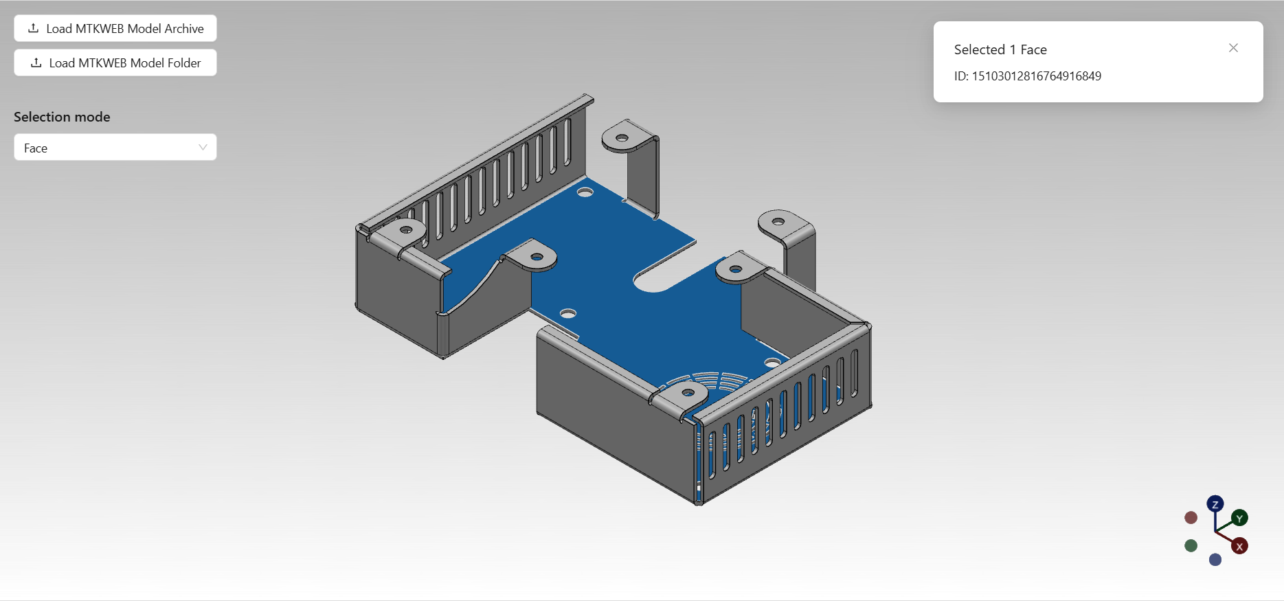
- Selection Mode Selector: Dropdown for choosing between node, face, and edge selection modes.
- Notification System: Displays contextual information about the current selection.
- Model Upload Controls: Allows users to upload 3D models for viewing and interaction.
- 3D Viewport: Renders the 3D scene and handles user interactions.
SelectionHandlingViewer.tsx
Location: react/src/pages/selection-handling-viewer/SelectionHandlingViewer.tsx
This is the main React component for the Selection Handling Viewer. It manages the viewer instance, handles model uploads, and provides UI controls for switching selection modes. The component listens for selection changes and uses a notification system to display details about the current selection, including selected node names or shape IDs.
export const SelectionHandlingViewer = () => {
const viewerRef = useRef<SelectionHandlingViewerRef>(new SelectionHandlingViewerRef());
const notification = useNotification();
const onUpload = useAsyncLock(async (files: File[]) => {
await viewerRef.current.loadAndDisplayModel(files);
});
const onSelectionModeChanged = (mode: ModelSceneSelectionMode) => {
viewerRef.current.selectionManager.sceneSelectionMode = mode;
};
const onSelectionChanged = () => {
// ...
notification.show(title, description);
};
useEffect(() => {
viewerRef.current.selectionManager.addEventListener('selectionChanged', onSelectionChanged);
return () => {
viewerRef.current.selectionManager.removeEventListener('selectionChanged', onSelectionChanged);
};
}, [viewerRef]);
return (
<div className="viewer-page">
{notification.contextHolder}
<Flex vertical gap="small" className="overlay-controls-container">
<ModelUploadButtonGroup onUpload={onUpload} />
<LabeledSelect
title="Selection mode"
selectPlaceholder="Choose selection mode"
selectDefaultValue={viewerRef.current.selectionManager.sceneSelectionMode}
selectOptions={selectionModeOptions}
onSelectValueChanged={onSelectionModeChanged}
/>
</Flex>
<Viewport viewportRef={viewerRef.current.viewport} />
</div>
);
};
LabeledSelect.tsx
Location: react/src/common/ui/labeled-select/LabeledSelect.tsx
A reusable component that renders a labeled dropdown selector with optional tooltip support. Used here to allow users to choose the selection mode (Node, Face, Edge) for the viewer.
export function LabeledSelect<T>(props: LabeledSelectProps<T>) {
// ...
return (
<div>
<Title level={5}>{props.title}</Title>
<Flex className="select-with-tooltip-container" gap="small">
<Select
className="select"
defaultValue={props.selectDefaultValue}
options={props.selectOptions}
popupMatchSelectWidth={false}
placeholder={props.selectPlaceholder}
onChange={onSelectValueChanged}
onDropdownVisibleChange={onSelectDropdownVisibleChange}
/>
{props.tooltipText && (
<Tooltip
title={props.tooltipText}
placement="bottomRight"
open={isTooltipOpen}
trigger="click"
arrow={{ pointAtCenter: true }}
>
<Button
type="default"
size="small"
shape="circle"
icon={<InfoCircleOutlined />}
onClick={onTooltipButtonClick}
/>
</Tooltip>
)}
</Flex>
</div>
);
}
useNotification.ts
Location: react/src/common/hooks/useNotification.ts
A custom React hook that provides a notification API for displaying contextual messages. Used to show details about the current selection, such as selected node names or shape IDs.
export const useNotification = (config: NotificationConfig = { maxCount: 1, duration: 0 }) => {
const [api, contextHolder] = notification.useNotification(config);
const keys = useRef<string[]>([]);
const show = useCallback((title: ReactNode, description: ReactNode) => {
// ...
api.open({ key: key, message: title, description: description });
}, [config]);
const closeAll = () => {
keys.current.length = 0;
api.destroy();
};
return {
contextHolder: contextHolder,
show: show,
closeAll: closeAll,
};
};
Note: Some UI components used in this example, such as ModelUploadButtonGroup, Viewport, and useAsyncLock, are shared with the Base Model Viewer and have been documented in the Base Model Viewer documentation.
Core Logic Components
The core logic layer of the Selection Handling Viewer provides advanced selection management for both the model structure and the 3D viewport. The architecture is designed around several key component categories:
- Viewer Management: Central orchestration of model loading and selection manager integration.
- Selection Management: Handles selection logic for nodes, faces, and edges, including multi-selection and keyboard modifiers.
SelectionHandlingViewer.ts
Location: shared/src/viewers/selection-handling-viewer/SelectionHandlingViewer.ts
Extends the BaseModelViewer and adds a ModelSelectionManager for advanced selection handling. Manages the lifecycle of the selection manager and integrates it with the viewer.
export class SelectionHandlingViewer extends BaseModelViewer {
readonly selectionManager = new ModelSelectionManager(this.viewport, this.modelStructure);
// ...
}
ModelSelectionManager.ts
Location: shared/src/features/model/interaction/ModelSelectionManager.ts
This class coordinates selection between the tree structure and 3D viewport. It supports multiple selection modes (node, face, edge) and handles keyboard modifiers for multi-selection. The manager synchronizes tree node selection with 3D object highlighting, manages shape-level selection for faces and edges, and provides unified selection events across both tree and viewport interactions.
export class ModelSelectionManager extends EventTarget {
private modelSelectionAdapter: ModelSelectionAdapter;
private modelIntersectionMapper: ModelIntersectionMapper;
private sceneRaycaster: SceneRaycaster;
// ...
}
ModelIntersectionMapper.ts
Location: shared/src/features/model/interaction/ModelIntersectionMapper.ts
This class maps 3D intersection results to model structure elements. It translates Three.js intersection data into corresponding tree nodes, faces, and edges from the model hierarchy. The mapper uses shape primitive groups and geometry indices to identify specific model elements from raycasting results.
export class ModelIntersectionMapper {
constructor(private readonly modelStructure: ModelStructure) {}
mapToBodyNode(intersection: Intersection): TreeNode<BodyNodeData> | null {
// ...
}
mapToFace(intersection: Intersection): Face | null {
// ...
}
mapToEdge(intersection: Intersection): Edge | null {
// ...
}
// ...
}
ModelSelectionAdapter.ts
Location: shared/src/features/model/interaction/ModelSelectionAdapter.ts
This class adapts between model-level selection operations and viewport-level object selection. It handles the translation of tree node selections to 3D object selections, manages shape-level selections for faces and edges, and computes primitive geometry groups for partial object selection. The adapter ensures proper material application and selection styling.
export class ModelSelectionAdapter {
constructor(private readonly objectSelectionManager: ObjectSelectionManager) {}
select(node: TreeNode<ModelStructureNodeData>, shapes?: Shape | Shape[], selectionStyle?: SelectionStyle) {
// ...
}
deselect(node: TreeNode<ModelStructureNodeData>, shapes?: Shape | Shape[]) {
// ...
}
// ...
}
ObjectSelectionManager.ts
Location: shared/src/features/viewport/interaction/ObjectSelectionManager.ts
This class manages visual selection of 3D objects in the viewport. It handles both full object selection and primitive-level selection (individual faces, edges). The manager applies custom selection materials and styles, manages geometry groups for partial selections, and provides efficient selection/deselection operations with proper material restoration.
export class ObjectSelectionManager extends EventTarget {
private selectedObjects: Map<Object3D, SelectedObjectData> = new Map();
select(object: Object3D, primitives?: PrimitiveGeometryGroup | PrimitiveGeometryGroup[], selectionStyle?: SelectionStyle) {
// ...
}
deselect(object: Object3D, primitives?: PrimitiveGeometryGroup | PrimitiveGeometryGroup[]) {
// ...
}
isSelected(object: Object3D, primitives?: PrimitiveGeometryGroup): boolean {
// ...
}
// ...
}
SceneRaycaster.ts
Location: shared/src/features/viewport/interaction/SceneRaycaster.ts
This class provides raycasting functionality for detecting intersections between mouse/pointer events and 3D objects in the scene. It handles pointer event management, converts screen coordinates to world space rays, and dispatches intersection events.
export class SceneRaycaster extends EventTarget {
private readonly raycaster = new Raycaster();
private pointerPosition = new Point2d();
private isPointerMoved = false;
intersect(pointerPosition: Point2d): Intersection[] {
// ...
}
// ...
}
Note: Some core components used in this example, such as BaseModelViewer, ModelStructure, and basic viewport functionality, are shared with the Base Model Viewer and have been documented in the Base Model Viewer documentation.
Viewer
Selection Handling Viewer
 Manufacturing Toolkit
