Manufacturing Toolkit

The Model Explorer Viewer example demonstrates how to integrate a feature-rich 3D model viewer with a hierarchical structure panel and a property inspection panel into a web application. This example is based on the Base Model Viewer and Model Structure Viewer, adding advanced capabilities for exploring model features and inspecting detailed properties of selected elements.
The Model Explorer Viewer's user interface is built using React and Ant Design components. The UI is organized into a three-pane layout:
Location: react/src/pages/model-explorer-viewer/ModelExplorerViewer.tsx
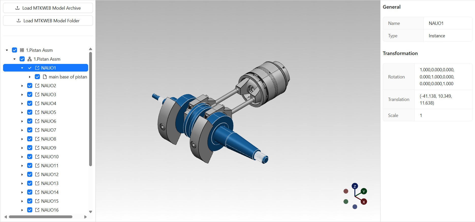
This is the main React component that orchestrates the Model Explorer Viewer interface. It manages model upload, selection state, and composes the three-pane layout using the Allotment component. The component synchronizes the selection between the structure panel and the property panel.
Location: react/src/pages/model-explorer-viewer/ui/property-panel/PropertyPanel.tsx
This component renders the property panel, which displays detailed information about the currently selected nodes in the model structure. For each selected node, it shows general properties (such as name and type) and, if applicable, transformation properties (rotation, translation, scale for Instance nodes). The panel supports multiple selection and uses the PropertyTable component to render property groups.
Location: react/src/common/ui/property-table/PropertyTable.tsx
A reusable component that displays a titled, bordered table of property items using Ant Design's Descriptions component. It is used by the PropertyPanel to render property groups for each selected node.
Note: Most UI components used in this example, such as ModelStructurePanel, Viewport, and ModelUploadButtonGroup, are shared with the Base Model Viewer and Model Structure Viewer. For more details, refer to the Base Model Viewer documentation and Model Structure Viewer documentation.
The core logic of the Model Explorer Viewer is implemented in the ModelExplorerViewer class, which directly extends the ModelStructureViewer class. This means all core logic—such as model loading, structure management, selection synchronization, and viewport interaction—is inherited from the Model Structure Viewer. No additional logic is introduced at this level.
Location: shared/src/viewers/model-explorer-viewer/ModelExplorerViewer.ts
This class is a thin extension of ModelStructureViewer. All core logic and architecture are described in the Model Structure Viewer documentation.
Note: For details on the core logic, including model management, tree synchronization, and selection handling, refer to the Model Structure Viewer documentation and Base Model Viewer documentation.